Sometimes a picture, or in this case a simple chart, provides us with a surprising degree of insight into the challenges of, and solutions to, investing well. The chart below plots the returns so far this year of the shares of all the large and mid-sized companies that make up the broad developed equity markets (a little over 1,500 in total). The best performers are to the left and the worst performers are to the right.
Figure 1: Year-to-date returns of developed market equities (1 January to 1 June) – in GBP
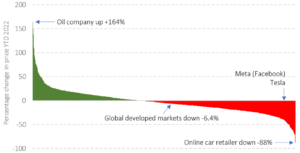
Source: Morningstar Direct© Copyright. All rights reserved.
So, what insights can this simple chart provide?
The first and most obvious is that there is an enormous range of outcomes, with gains from 164% to falls of 88%, yet the aggregate global market is down only a little over 6%. That may be considerably less than many investors might have thought, given the gloomy financial news reported by the media that tends to focus on the big stories to the right of the chart e.g. Meta and Tesla.

Secondly, an active manager should be looking at this chart with glee, as they claim to have the skill and the opportunity (evidenced by the chart), to be able to pick market-beating combinations of stocks to own. The empirical evidence suggests that almost none do so to the benefit of investors, persistently over time.
Imagine for a moment a two-investor market, where the first investor has picked only green stocks in the chart. By definition they must have been sold them by the second investor. In aggregate, they both own the market and will receive the return of the market less their combined fees and trading costs. Individually, the gains of the first investor must be funded by the losses of the second.
Conversely, a passive investor who believes that the market sets prices that reflect all publicly known information, thereby making it very difficult to outsmart the market, would look at the chart and accept that owning the market in its entirety, e.g. through an index fund, is a sensible option. It should deliver a smoother and more predictable investment journey than random periods of over and underperformance delivered by active management. As costs incurred by passive investors are less than those by active investors, the average passive investor will achieve better returns than the average active investor over time. While diversification will never deliver you with the most spectacular returns, it will make sure you avoid the egregious losses that could result from being concentrated in the worst performers. In investing, that is an important goal and outcome.

Thirdly, and perhaps less obviously, passive investing has been criticised for driving up stock prices, due to the large flows of money moving into index tracking funds. That is a weak argument. Logic tells us that as index funds own all companies in the market in their market weights, fund flows should impact all prices equally . It is worth remembering that the shares an index fund buys largely comes from the aggregate active portfolio, which is the same as the aggregate passive portfolio i.e. the market! The implication that index funds set market prices has to be wrong, not least given the dispersion of outcomes of share prices evidenced in our chart. Index funds are price takers not price makers.
All this from one simple chart!
Investment Risk Warning
Please remember the value of your investments and any income from them can go down as well as up and you may get back less than the amount you originally invested. All investments carry an element of risk which may differ significantly. If you are unsure as to the suitability of any particular investment or product, you should seek professional financial advice.